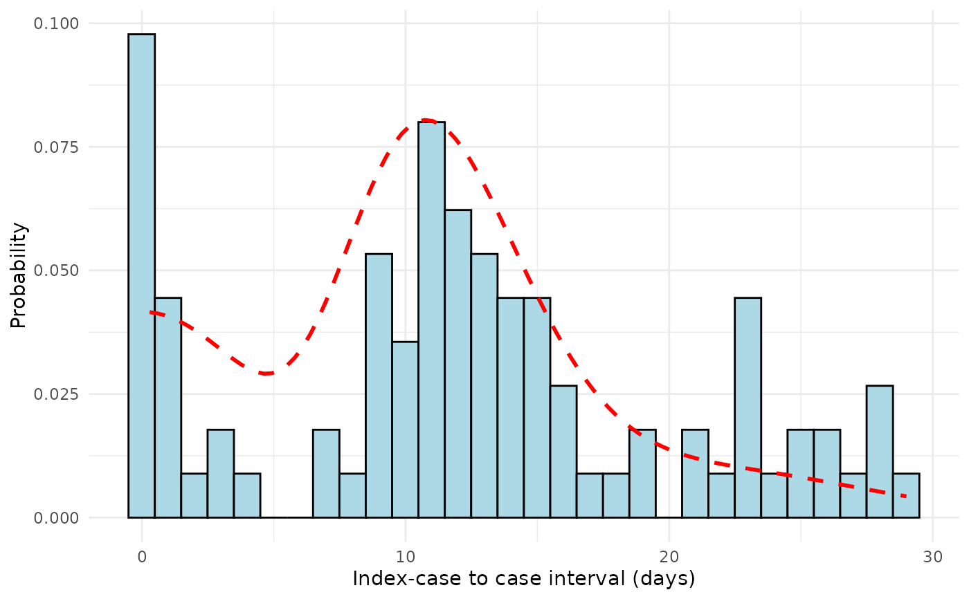
Creates a diagnostic plot showing the fitted serial interval mixture distribution overlaid on a histogram of observed index case-to-case (ICC) intervals from outbreak data.
Arguments
- dat
numeric vector; the index case-to-case (ICC) intervals in days.
- mean
numeric; the estimated mean of the serial interval distribution in days.
- sd
numeric; the estimated standard deviation of the serial interval distribution in days.
- weights
numeric vector of length n_routes - 1; the estimated weights for each transmission route component, starting from Co-primary. The last route weight is derived internally as 1 - sum(weights).
- dist
character; the distribution family. Must be either "normal" (default) or "gamma".
- scaling_factor
numeric; multiplicative factor to adjust the height of the fitted density curve. Defaults to 1.
- n_routes
integer; number of transmission routes modelled. Must be >= 2. Defaults to 4. Must match the value used in
si_estim().
References
Vink MA, Bootsma MCJ, Wallinga J (2014). Serial intervals of respiratory infectious diseases: A systematic review and analysis. American Journal of Epidemiology, 180(9), 865-875.
Examples
# Example 1: 4 routes, normal distribution
set.seed(123)
icc_data <- c(
  rnorm(20, mean = 0, sd = 2),
  rnorm(50, mean = 12, sd = 3),
  rnorm(20, mean = 24, sd = 4)
)
icc_data <- round(pmax(icc_data, 0))

plot_si_fit(
  dat = icc_data,
  mean = 12.5,
  sd = 3.2,
  weights = c(0.2, 0.6, 0.15, 0.05),
  dist = "normal",
  n_routes = 4
)


# Example 2: 5 routes, gamma distribution
plot_si_fit(
  dat = icc_data,
  mean = 12.0,
  sd = 3.5,
  weights = c(0.25, 0.65, 0.05, 0.03, 0.02),
  dist = "gamma",
  n_routes = 5,
  scaling_factor = 0.8
)
#> Warning: Computation failed in `stat_function()`.
#> Caused by error in `fun()`:
#> ! unused argument (n_routes = 5)
# Example 2: 5 routes, gamma distribution
plot_si_fit(
dat = icc_data,
mean = 12.0,
sd = 3.5,
weights = c(0.25, 0.65, 0.05, 0.03, 0.02),
dist = "gamma",
n_routes = 5,
scaling_factor = 0.8
)
#> Warning: Computation failed in `stat_function()`.
#> Caused by error in `fun()`:
#> ! unused argument (n_routes = 5)